A Pareto chart is a powerful visualization that helps identify the most significant factors in a dataset. It combines a bar chart and a line chart, showing both individual and cumulative contributions of categories. In this guide, we’ll walk through creating a Pareto chart in Power BI using DAX.
Why Use a Pareto Chart?
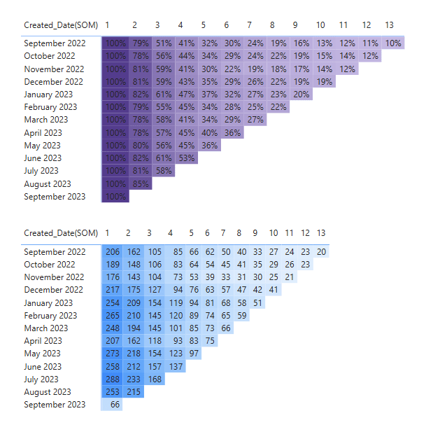
The Pareto Principle (80/20 rule) states that roughly 80% of effects come from 20% of the causes. In business analytics, this chart helps prioritize efforts by highlighting the most impactful categories.
Steps to Create a Pareto Chart in Power BI
1. Load Your Dataset
First, import your dataset into Power BI. Ensure it includes a categorical column (e.g., Product, Customer, Region) and a numerical column (e.g., Sales, Revenue, Orders).
2. Create the Total Sales Measure
We need to calculate total sales using a DAX measure:
Total Sales = SUM(Sales[Amount])3. Rank the Categories by Sales
To rank the categories in descending order based on sales, create a Rank Measure:
Rank by Sales =
RANKX(
    ALL(Sales[Category]),
    [Total Sales],
    , DESC, DENSE
)
4. Calculate Cumulative Sales
To compute the cumulative sales, use this DAX formula:
Cumulative Sales =
VAR CurrentCategory = SELECTEDVALUE(Sales[Category])
RETURN
CALCULATE(
    [Total Sales],
    FILTER(
        ALL(Sales[Category]),
        [Rank by Sales] <=
        CALCULATE([Rank by Sales], Sales[Category] = CurrentCategory)
    )
)
5. Compute Cumulative Percentage
Next, divide the cumulative sales by the total sales to get the cumulative percentage:
Cumulative % =
DIVIDE([Cumulative Sales], CALCULATE([Total Sales], ALL(Sales)))
6. Create the Pareto Chart
- Insert a Clustered Column Chart for categories vs. total sales.
- Add a Line Chart to the same visual.
- Set the Y-axis (columns) to Total Sales.
- Set the Y-axis (line) to Cumulative %.
- Format the line to display as a percentage.
7. Add a Reference Line at 80%
To highlight the Pareto threshold, add a constant line at 80% in the analytics pane.
Final Thoughts
A Pareto chart in Power BI using DAX helps identify key contributors to business success. By leveraging DAX formulas, you can create an interactive and insightful visualization to make data-driven decisions.
For more Power BI tutorials, visit Analytics With Bani. 🚀